Using radar charts to visualize information literacy objectives in the context of the information literacy framework: Some limitations and variations
Andrew Shields, librarian, Goshen College
August 6, 2015
We sat around our little table, trying to express how we thought the fitting-together-and-interdependency of the six frames of the ACRL’s new(-ish) Framework for Information Literacy for Higher Education changed the way we represented the relationship between our student learning objectives for information literacy and the ACRL’s “recommendation”. The librarians who originally led the development of our learning objectives had left us with a list of objectives1 for each learning activity, annotated so that each objective was explicitly tied to an outcome or outcomes in the ACRL’s older Information Literacy Competency Standards for Higher Education. For instance, those librarians had tied their learning objective:
Students will determine if retrieved information satisfied need and will refine search if necessary. (2.4.a)(2.4.c)(1.4.a)2
to
[2.4.a] Assesses the quantity, quality, and relevance of the search results to determine whether alternative information retrieval systems or investigative methods should be utilized
[2.4.c] Repeats the search using the revised strategy as necessary
[1.4.a] Reviews the initial information need to clarify, revise, or refine the question3
in the information literacy standards.
This example is not particularly representative, as only five of the twenty-two distinct objectives were connected with three outcomes. The remaining objectives divided evenly between having one or two outcomes. In fact, because many objectives shared outcomes, only twenty-six of the standard’s 87 outcomes were referenced.
All this is not to say that the librarians who developed our learning objectives missed something or didn’t do their jobs, nor to suggest that our information literacy instruction was somehow incomplete. (They didn’t, they did, and it wasn’t.) Rather, it serves as background to our first attempt to represent the relationship between our learning objectives and the information literacy frames, in which we assigned each objective to a frame.
As we discussed our learning objectives and instruction opportunities for the coming year, however, the current team of librarians increasingly articulated our dissatisfaction with this approach. In particular, we argued, the new framework does a good job of expressing the interdependence of the six frames it identifies and cultivates a holistic understanding of information literacy4. “Students will determine if retrieved information satisfied need and will refine search if necessary.” isn’t just about understanding “searching as strategic exploration”, it’s also practicing “research as inquiry” and acknowledging that “authority is constructed and contextual”.5
We started tossing out ideas: a table would get complicated fast. Venn diagrams, shaped whimsically like the Olympic rings? A hexagon? plotted how? And then, as we threw words into an image search engine to put a name to the fuzzy picture in our heads, Fritz recalled a style of chart which had been used to illustrate the stats of basketball players.
These charts (which we took to calling radar charts, although that name is sometimes used to refer to an open line chart on a polar grid) displayed either the stats of an individual player or the cumulative stats of a team with a separate axis for each statistic arranged radially at equal intervals. When each value had been plotted on the appropriate axis, the plotted values were connected to form a closed rectilinear shape highlighted with a color fill.
For example, in February 2013, as their “infographic of the day”, Fast Company featured posters (designed by Rami Moghadam) which showed the east and west teams of the 2013 NBA All-Stars plotted6 according to eleven different statistical dimensions. (Fast Company called the charts “statistical snowflakes”.) Each player has his own chart, and it’s easy to see at a glance, for instance, that Joakim Noah specialized in rebounds but didn’t score that many points.
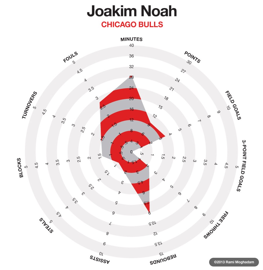
Joakim Noah: Career Regular Season per Game Averages by Rami Moghadam; an example of a radar-type chart used to plot sports statistics
Looking at this chart, one can see that the designer has attempted to include many different kinds of statistics related to the player. The chart thereby illustrates the first potential shortcoming of radar charts: as with bar charts or area charts, switching the units or scales of your axes makes it more difficult to understand the chart at a glance. Particularly worrisome is the first axis counterclockwise of the top (“Fouls”), since on that axis, unlike most of the others, better players will have lower, and therefore smaller, values.7
In this case, these inconsistencies don’t detract much from the power of these charts as presented: the primary use case is the comparison of one player’s chart to another; provided the axes are aligned, the designer’s point will be made. However, for our purposes, since the most logical use of a radar chart was to assign each of the six frames an axis—and since it was the interdependence of the frames which drove us to explore this style of chart to begin with—we had to ensure that our axes remained comparable and therefore that they were given in the same units and the same scale. Easy enough. On our charts, all six axes span a linear range zero through five8 and all use the same unit9.
A second potential shortcoming of many radar charts is the failure to obey our symbolic spatial intuition that images or areas which are opposite one another represent things which are opposite one another, and, by consequence, images or areas which are adjacent to one another are more similar to each other than to images or areas further away.10 Again, the 2013 NBA All-Stars charts illustrate this shortcoming well. ‘Points’ are not the opposite of either ‘assists’ or ‘steals’, nor are the latter two particularly similar to one another, which is how, in the case of someone like Dwayne Wade, the resulting chart can be a dense shape in one quadrant with spikes shooting out at irregular intervals in the other quadrants.
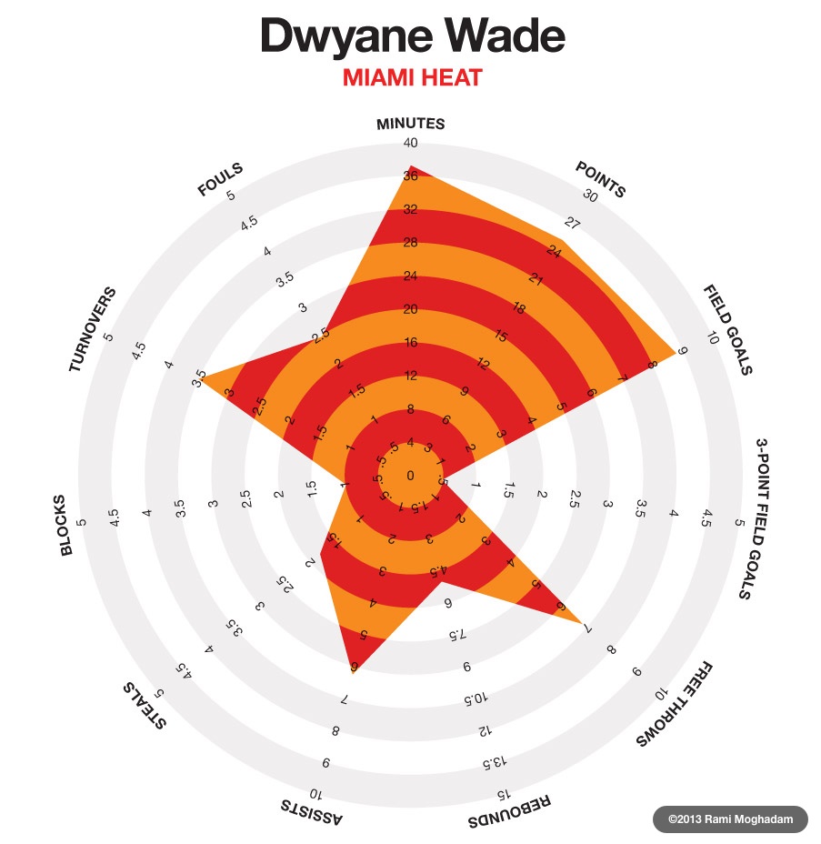
Dwayne Wade: Career Regular Season per Game Averages by Rami Moghadam; if the axes had well-defined relationships to one another and were organized to reflect those relationships, we would expect the dimensions in which Wade scores highly to be adjacent, rather than spread out irregularly around the circumference
I found this flaw particularly frustrating as experimented with chart designs. The authors of the information literacy framework present the frames in alphabetical order, illustrating immediately that no special relationship, of similarity or of opposition, exists among the frames. We might, prima facie, assume that “research as inquiry” is more closely related to “searching as strategic exploration” than the others, until we read it carefully and realize that it depends on (and is dependent on) “authority is constructed and contextual” and even “information has value”. To assert that underlying interdependence and then to produce a chart which implicitly opposes “research as inquiry” and “authority is constructed and contextual” remains a frustration. In this respect, a traditional area chart is probably preferable; its detractions, that one frame must be first and another last and that it still breaks the intuition that adjacency is similarity, have already been encountered in the arrangement of the framework itself.
Grant these shortcomings for the moment. What do we hope to achieve by plotting the quantified relationships between our learning objectives and the information literacy frames? The day we sat around our little table looking for a new way to visualize those relationships, we were, you will recall, captivated by the idea that “the framework…cultivates a holistic understanding of information literacy instruction”. Our review of the framework that day inspired us to look for (and try to introduce, where we didn’t find it) the balance and holism we thought should underpin our information literacy instruction when we saw it through the lens of the framework. A chart that visually showed the strengths and weaknesses of our objectives by mapping their support of each frame could provide (easily grasped) theoretical confirmation or rejection of our hypothesis and provide the opportunity to review hypothetical gaps in our assignment of objectives to instruction opportunities. By closing those gaps with objectives chosen to better cover the all of the frames (we expected simple additions or substitutions), we would be setting ourselves up to provide better quality information literacy instruction at every instruction opportunity.
In order to achieve this, what we needed was not the plots of individual learning objectives, but the cumulative contribution of all the objectives for an individual instruction session. We thought, for a start, that we could get a picture of this by layering the charts of all the learning objectives for a particular instruction session.
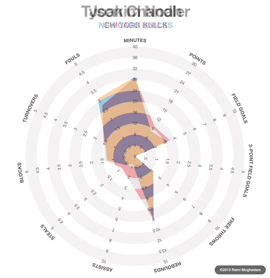
Joakim Noah and Tyson Chandler: Career Regular Season per Game Averages by Rami Moghadam (layered); Noah and Chandler aren’t very complementary and need other players to round out their abilities—exactly the kind of gap we were looking for in our instruction session learning objectives
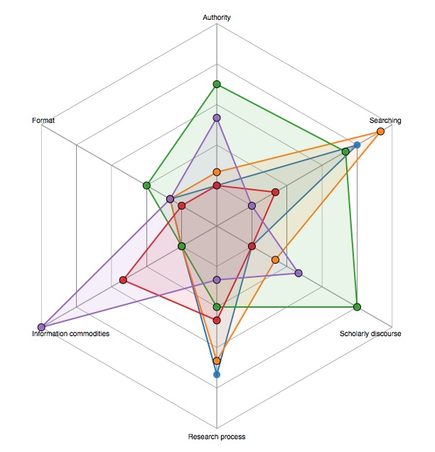
An early draft of the radar chart for the first-year writing courses instruction sessions; the many colored layers (each representing an individual learning objective), while pretty, make the chart confusing and difficult to read
Our earliest implementations of charts layering multiple learning objectives, like the example above, present a jumble of information: they are logically organized, but not visually organized. In particular, the overlapping spikes draw the eye to the space between the axes and the criss-crossing lines which occupy that space. The space between axes has no logical significance on a radar chart, however, since it exists only to serve the constraints of two-dimensional space and, incidentally, provides space for gridlines, labels, and the like. The criss-crossing lines are even worse, from an interpretive point of view, since we have been trained to expect significance in the crossing points by traditional multi-line line graphs. In our radar chart, though, because there is no defined relationship between any two axes, there is no meaning to the crossing of the yellow and green lines between the axes labeled “Scholarly discourse” and “Research process”, nor to the roughly paralleling red line, nor even to the fact that the yellow line crosses the blue line more closely to the center than it cross the green line. All this visual information, for which our eyes and brain demand an explanation is extraneous. If anything, by layering the plotted areas, we have aggravated and emphasized the shortcomings of radar charts.
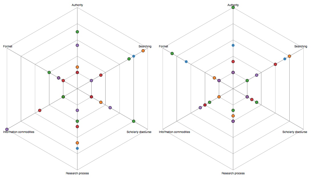
Two multi-objective radar charts with the connecting inter-axial lines removed: on the left, the same first-year writing course instruction session learning objectives as the previous figure, and, on the right, the learning objectives for the Core 100 online tutorial; with the distractions removed, these charts are more readable and remain easily distinguishable
By removing the connecting inter-axial lines (and, consequently the shaded areas which they enclose), the radar charts are easier to read, but have perhaps sacrificed some of their visual expressiveness. All the information is still there, but the strength of the distinctive at-a-glance character which is present in the basketball radar charts is diminished. Where the basketball radar charts appeal strongly to our spatial intuitions (that same characteristic which makes them, in some ways, more troublesome), these denuded charts are really no better than line graphs or scatter plots. Faced with this realization, we considered radically revising our charting plans: adapting wedge charts or creating a polar-bar hybrid. These variations would have reintroduced some visual complexity, though, and we realized as we struggled to strike a balance between appealing to spatial intuition and overwhelming and confusing it that we weren’t that interested in the individual learning objectives are all—we were interested in the summative effect of the learning objective combined to describe a class. We needed to add a single feature on our charts to show “the cumulative contribution of all the objectives for an individual instruction session”, to add more was to add noise.
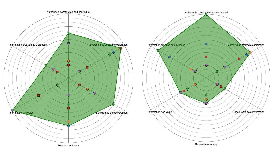
Final version of the radar charts: the symbols provide the ‘scatter’ of data points along axes, while the filled area shows the cumulative effect of the combined learning objectives; the result is an information-dense chart which gives an accurate overall impression at-a-glance and does a good job fulfilling our spatial intuitions
This final chart style meets our requirements by providing a straightforward and easily analyzed presentation of the cumulative effect of the learning objectives for a given information literacy instruction session. The strengths and weaknesses of a particular combination of learning objectives from the perspective of the information literacy framework are clearly and distinctively expressed through the single filled area, while the individual learning objectives are still visible for more in-depth analysis. All six axes use the same unit and scale, so that the values are comparable. In short, we have a good chart for quickly illustrating the utility (or lack thereof) of a particular combination of our existing learning objectives to teachers and administrators which is still information-dense enough for our own use as we plan for information literacy instruction opportunities.
If you are interested in experimenting with this style of chart for a similar purpose, I’ve made a simple tool for that.
-
Those librarians called these ‘outcomes’, a word taken directly from the Information Literacy Competency Standards. I’m not sure why we’ve increasingly referred to them as ‘objectives’, but I prefer the stronger sense of deliberation and intentionality ‘objectives’ implies.
For more information about what ‘outcomes’ and ‘objectives’ refer to, see the section “Information Literacy and Assessment” in the ACRL information literacy standards.↩
-
The Harold and Wilma Good Library. (2009, June 10). Information literacy learning outcomes: Good Library instruction program. Goshen, IN: Milne.↩
-
Board of Directors of the Association of College and Research Libraries (ACRL). (2010, February 2). Framework for information literacy for higher education. Retrieved from http://www.ala.org/acrl/standards/ilframework↩
-
I want to go a step further than this, and say that the framework cultivates a holistic understanding of information literacy instruction, but this is something about which my colleagues and I are not completely in agreement. Quite a bit hinges on the exact usage of the word ‘holistic’. I mean it, in this case, to indicate an understanding aimed not at discrete skills but at a mindset and a general activity.↩
-
If this seems contrived, it is. We don’t particularly care for the frame titles and agree that you have to read—at the very least—the first, summative paragraph of each frame in order to grasp the frames’ scope. Even if you’ve already read them, it’s dense, nuanced text—read them again.↩
-
With career game averages for the regular season.↩
-
The next axis, moving counterclockwise, is a similar situation. For reasons which I’ll discuss in a minute, it’s good that these two inverted statistics—in which a lower value is generally better—are placed next to one another.↩
-
Actually, while the axes’ range appears to start at zero, the ranking scale starts at one. This has two consequences: first, it reinforces a corollary of our assertion that the frames are interdependent, which is that if a learning objective supports a single frame, it must to some extent support every frame, or be ineffective. Second, by preventing the data points from coinciding with center of the chart, it remains easy to identify the data point for each objective as we layer multiple objectives on the chart.↩
-
The scale is arbitrary; it was picked for its ubiquity and therefore familiarity. Likewise, we found it difficult to agree on exactly what we intended to quantify when we ranked our learning objectives with respect to the frames. Ultimately, we decided to rank to answer the question, “Does this objective promote the awareness described in this frame?”, where ‘1’ is ‘barely’ and ‘5’ is ‘exactly’.↩
-
Consider, for example, a color wheel: red and green are opposite each other and generally have opposite traits. Blue and purple, on the other hand are adjacent and generally have similar traits.
Bar charts, while eliminating the ‘opposite’ position, still often defy our intuition about adjacency. This may be why bar charts that lack an internally-enforced order (which can be found, for instance, in the progression of financial quarters on an earnings chart) are frequently arranged to in ascending or descending order by total quantity.↩